Recent searches
Search options

Administered by:

#dataviz


Distanamo is an R package by Matthieu Viry for creating distance cartograms (distance anamorphoses). It helps visualize spatial distortions based on distance constraints.
Learn more: https://buff.ly/v7gxXNq


Recent data doodle - arc diagram of morning peak trip flows on TTC Line 2


The self promotion continues - Voting is open for the DH Awards 2024, and "Lines of Flight" is in the category of "Best Use of DH for Fun". If you have played or enjoyed Lines of Flight, I'd love for you to give it a vote!

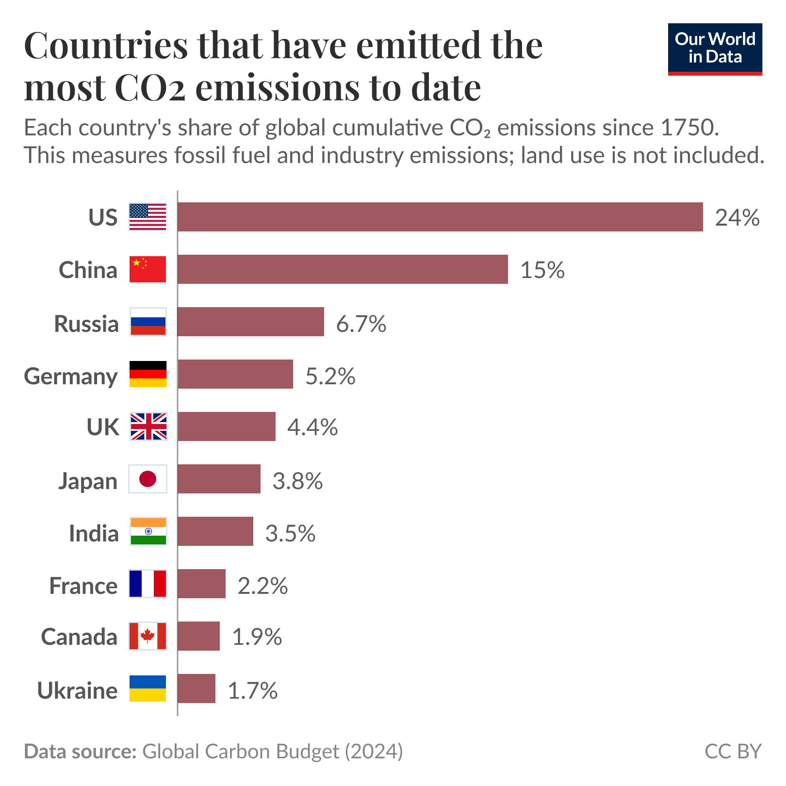

With an ongoing trade war and stocks sliding into correction territory in the last week, a question emerges: Is a recession next? Jasmine Cui, the NBC News reporter on the data / graphics team, details what the recessionary data signals and economists say: https://www.nbcnews.com/data-graphics/recession-warning-signs-trump-economy-what-know-charts-rcna196221 #dataViz


[#veille] Portraits d'archivistes - #AAFRennes2025 : datavisualisations à partir de la liste des inscrit.e.s
https://patrimoine-et-numerique.fr/data-visualisations/89-portaits-darchivistes-aafrennes2025
#archives #archivistes #datalove #dataviz #datavisualisation #OpenRefine #Flourish #map
@archivistodon #archivistodons

")

Slowly making updates to my #StickersAndStamps project.


A FLuQE wavelet opened September, cresting as KP.3.1.1 / MC wave into November. FDA's second-guess vaccine target, KP.2, dropped out in December. Updated #CDC estimates indicate we've been in a JN.1.11 soup pretty much since then.
No new variants broken out by CDC, as KP.1.1.3 / LP descendant LP.8.1 approaches majority.
No recent GISAID data—as Raj's dashboard hasn't updated in near a month.
❖ #ThisIsOurPolio #Covid #Covid19 #SARS2 #variants #CovidIsNotOver #CovidIsAirborne #dataviz #datavis
![Chart: Estimated U.S. Variant Proportions by Common Name
Sources: Centers for Disease Control, CoV-Lineages, NYITCOM Research, Daniele Focosi, World Health Network, others
[ beadsland on Ko-fi ]
Reskin of CDC's Variants Nowcast, and any significant variants in GISAID not broken out by CDC.
Five bar-style tree-charts, for fortnights through March 2–15. Legend of last fortnight, organized by subheadings of color-grouped families and convergent clusters. Percentages overlay each color key, reflecting share as of most recent tree-chart.
Essentially all WHO-Vaccine-Target JN.1. JN.1.11 accounts for over three fifths; JN.1.11 + FLiRT for near half.
For fortnight of 1/19–2/1, packed bubble charts fill single-variant tiles, indicating diversification of those variants (per GISAID) that wouldn't otherwise be apparent from CDC's Nowcast.
Legend:
LP.8.1 [purple]:
47% - LP.8.1.1 / NY† & other LP.8.1
JN.1 + FLiRT-KS [browns]:
26% - XEC.2†, XEC.8† & other XEC
2% - XEC.4
2% - XEQ
⅒% - other KS.1
JN.1.11 [greens]:
¾% - KP.3
15% - MC.10.1, MC.28.1, MC.19, MC.1 & other KP.3.1.1 / MC
JN.1 + FLiRT [reds]:
4% - LF.7
3% - LB.1.3.1 / NL
0% - LB.1
JN.1.11 + FLiRT [blues]:
½% - XEK
0% - KP.2.3 & KP.1.1.3 / LP
Other [greys]:
½% - JN.1.16
⅐% - other WHO-Vaccine-Target JN.1
⅒% - Other (not specified)
† Dagger variants are not broken out by CDC, yet represent a significant share of recent GISAID sequences.](https://spaces.hcommons.social/media_attachments/files/114/163/035/799/833/179/original/9a1523ae932eddff.jpg "Chart: Estimated U.S. Variant Proportions by Common Name
Sources: Centers for Disease Control, CoV-Lineages, NYITCOM Research, Daniele Focosi, World Health Network, others
[ beadsland on Ko-fi ]
Reskin of CDC's Variants Nowcast, and any significant variants in GISAID not broken out by CDC.
Five bar-style tree-charts, for fortnights through March 2–15. Legend of last fortnight, organized by subheadings of color-grouped families and convergent clusters. Percentages overlay each color key, reflecting share as of most recent tree-chart.
Essentially all WHO-Vaccine-Target JN.1. JN.1.11 accounts for over three fifths; JN.1.11 + FLiRT for near half.
For fortnight of 1/19–2/1, packed bubble charts fill single-variant tiles, indicating diversification of those variants (per GISAID) that wouldn't otherwise be apparent from CDC's Nowcast.
Legend:
LP.8.1 [purple]:
47% - LP.8.1.1 / NY† & other LP.8.1
JN.1 + FLiRT-KS [browns]:
26% - XEC.2†, XEC.8† & other XEC
2% - XEC.4
2% - XEQ
⅒% - other KS.1
JN.1.11 [greens]:
¾% - KP.3
15% - MC.10.1, MC.28.1, MC.19, MC.1 & other KP.3.1.1 / MC
JN.1 + FLiRT [reds]:
4% - LF.7
3% - LB.1.3.1 / NL
0% - LB.1
JN.1.11 + FLiRT [blues]:
½% - XEK
0% - KP.2.3 & KP.1.1.3 / LP
Other [greys]:
½% - JN.1.16
⅐% - other WHO-Vaccine-Target JN.1
⅒% - Other (not specified)
† Dagger variants are not broken out by CDC, yet represent a significant share of recent GISAID sequences.")
Happy Pi Day! I'm reminded of this old piece on Pie charts: "In Defense of Pie Charts, and Why You Shouldn’t Use Them"
https://medium.com/@kristinhenry/in-defense-of-pie-charts-and-why-you-shouldnt-use-them-df2e8ccb5f76


This video is a really pretty visualization of the A* pathfinding algorithm using #OpenStreetMap road network data for #Chicago and #Rome as examples.

My visualisation of Australian fruit and veg seasonality made the Information is Beautiful awards longlist.
As the food bowl of Australia was flooded thanks to #CycloneAlfred, the information in the guide may be off for a bit until we recover!


#Dataviz books everyone should read  - a community sourced #charticle https://informationisbeautiful.net/visualizations/dataviz-books/ Created in association with @DataVizSociety #iibwab


 New blog post about data art!
Have you ever wondered:
 What is data-driven art?
 Why do people make data art?
 How do I get started making my own?
Then this blog post is for you!  It includes an example using #TidyTuesday data - with code in both #Python and #RStats!

Some light reading for a bit of a distraction, if you will: Vivian Li from @thepudding looked at how "cultures can hear the same physical sounds yet translate them into language so differently".

Neat. My "Analyzing fediverse followers of my creative online bots" data visualization was accepted for this year's Information is Beautiful Awards' longlist.
I'm super happy to see that several of my data visualisation projects were long-listed at the 2024 Information is Beautiful Awards!
Check out the full longlist here: https://www.informationisbeautifulawards.com/showcase?action=index&award=2024&controller=showcase&page=1&pcategory=long-list&type=awards


Sometimes, updating a Data Art piece is just too much of an emotional drain. And the piece must remain out of date.
But to be honest, that's part of the piece itself.
How Big is 400,000? https://kristinhenry.github.io/howBig/
I wrote a bit about the piece: https://kristinhenry.medium.com/how-big-is-400-000-922841dbc986

Pretty fascinating look at how "Covid changed everything", in 30 charts.
"Decades from now, the pandemic will be visible in the historical data of nearly anything measurable today: an unmistakable spike, dip or jolt that officially began for Americans five years ago this week."
Process spatial data and create reproducible maps with R using "Cartography with R" by Timothée Giraud. Covers R Spatial, data manipulation, thematic maps, and more.
Read it at: https://buff.ly/sIqGXss
